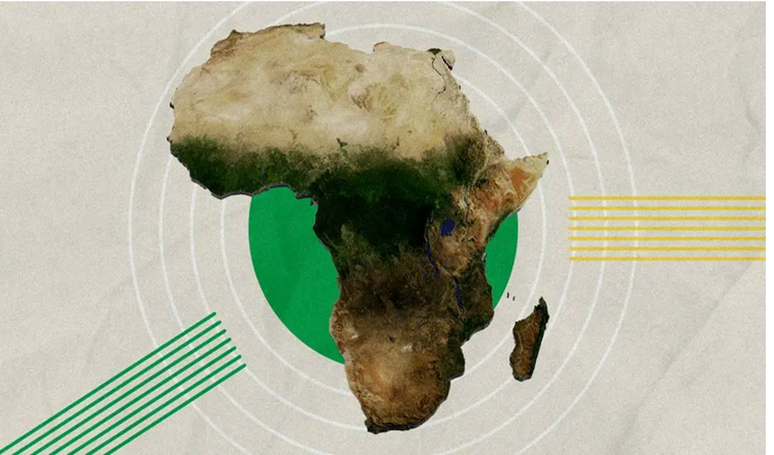
? Imagine the true size of Africa.. Why do western maps depict the brown continent so small

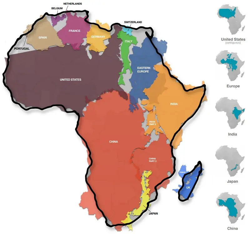
I admit that it shocked me when I first noticed it. Is the true size of the continent of Africa really larger than the size of about 18 vast countries, including the United States of America, China, India, Indonesia and a large group of European countries?
This is unfortunately the truth that was finally revealed by modern maps, which came with much greater accuracy than the old maps drawn by Europeans for citizens in their countries, and interfered even in basic facts and abstract information, to delude the inhabitants of the brown continent that they are not only inferior in human status, but in geographical and spatial also.
If we take a look at any old map, it becomes clear to us that the continent of Africa is vast in area, but nevertheless it is much less than its normal size compared to anywhere else around the world, which clearly distorts our final perception of the relative sizes of the rest of the countries and continents.
The real size of the African continent

The information may seem abstract scientific, but a quick look at it will make you understand what deception the world has been exposed to over centuries in visualizing the shape of the world and the size of the continents and their relationship to each other. .
It is known to all geographical survey and geologists scientists that the area of the African continent is 30.37 million square kilometers, and a simple calculation of more than 18 countries and the ratio of its area to Africa, it becomes clear to us that it is much larger than what is drawn, and the countries that were compared were as follows:
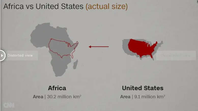
The United States of America is 9.83 million square kilometers, or 32.4% of the area of Africa.
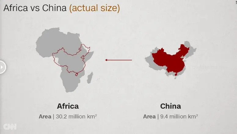
China is 9.60 million square kilometers, or 31.6% of the area of Africa.
India is 3.29 million square kilometers, or 10.8% of the area of Africa.
Mexico 1.96 million square kilometers or 6.5% of the area of Africa.
Peru 1.29 million square kilometers, or 4.2% of the area of Africa.
France has 0.64 million square kilometers, or 2.1% of the area of Africa.
Spain is 0.51 million square kilometers, or 1.7% of the area of Africa.
Papua New Guinea is 0.46 million square kilometers, or 1.5% of the area of Africa.
Sweden is 0.45 million square kilometers, or 1.5% of the area of Africa.
Japan is 0.38 million square kilometers, or 1.3% of the area of Africa.
Germany 0.36 million square kilometers or 1.2% of the area of Africa.
Norway is 0.32 million square kilometers, or 1.1% of the area of Africa.
Italy is 0.30 million square kilometres, or 1.0% of the area of Africa.
New Zealand is 0.27 million square kilometers, or 0.9% of the area of Africa.
The United Kingdom is 0.24 million square kilometres, or 0.8% of the area of Africa.
Nepal is 0.15 million square kilometers, or 0.5% of the area of Africa.
Bangladesh is 0.15 million square kilometers, or 0.5% of the area of Africa.
Greece is 0.13 million square kilometers, or 0.4% of the area of Africa.
Total 30.33 million square kilometers is 99.9% of the area of Africa.
So it is clear from these simple comparisons that the area of the continent of Africa is more than 3 times the size of the United States of America, meaning that on the map it should have been very close to the size of the two continents together, and not just the size of the South American continent as it seems now. Why did this small drawing come and for what purpose?
The reason for the misperception of the size of Africa on the maps

In fact, the problem with maps is not that the size of Africa is incorrect. On the contrary, the size of Africa is considered to be the most accurate using the Mercator map projection, the most common in cartography, a method invented by the Flemish geographer and cartographer Gerardus Mercator.
This method is based on imagining that the globe is surrounded by a cylinder that touches it at the equator, which leads to the projection of all the features of the Earth on the cylinder, and then it is opened so that the shape of the map is a rectangle with horizontal and vertical lines, and so that the vertical lines are parallel and at equal distances, while the transverse lines They are also parallel but far apart as the distance between the latitudes increases as the poles are approached.
The problem with this method is that it changes the shape of the continents, and the distortion increases the closer we get to the poles, as the regions closest to the poles are "stretched", giving them a larger size than their true size on this type of map, while Africa near the equator remains almost the same size without change .
And this dilemma is in fact interesting not only in Africa, but it is considered more influential in the entire southern hemisphere, be it South America, India, the Middle East and even Australia, as it gives us an incorrect mental perception to judge the relative sizes of other countries.
? Did Western countries deliberately paint Africa in a smaller way

In fact, this question is difficult to answer. While the initiative to know the true size of the continents was launched from Boston schools in the United States of America to help students know the world from a different perspective, this does not negate the responsibility of European colonialism.
One of the dangers of the Mercator map is that it can make the tightened or expanded countries look abnormally large, strong, and frighteningly unrealistic, and while Canada appears on the map almost equal to Africa, in reality the brown continent can expand to 3 countries from Canada And while Russia appears to be vast in size, it is, but not to the point of comparing it to the size of Africa.
Professors of media and politics assert that the maps prevalent until the third millennium exist and are considered the most famous since the era of the British Empire, which certainly had an interest in showing African countries in a smaller form, but was this
? intentional
In fact, geographers assert that there is no perfect map, and this is because the Earth is spherical and closer to the shape of a potato and it is impossible to draw it on a flat surface without errors in proportion. There is, for example, the Peters projection that Boston schools have begun to advocate, which actually shows the actual size of the globe's continents, but on the other hand shows them distorted and not as accurate in form as Mercator's perspective.
Other countries such as Germany and the United States of America have also started to use another projection in mapping, the Winkel Tripel, which has fewer aberrations and distortions.
But the reality is that the Mercator method is still the most famous and the digital revolution has consolidated its position after it was officially adopted in Google Maps, Bing, OpenStreetMap and others.
If it is not possible at the present time to obtain an accurate map in shape and size of the world’s continents, it is necessary for students around the world to read at least the real proportions to get to know the true size of the different countries and continents, and to get rid of the false sense of power and dominance of some countries at the expense of others around the world.
https://www.arageek.com/2021/12/18/map-true-size-of-africa?fbclid=IwAR0x0l3Yu2C95rrSR8_9rVQJr41VyRsNbGP4b0RAF6CxApVhN8A3rvoHlk8

